Changelog
Follow up on the latest improvements and updates.
RSS
new
Analytics
Dashboard 2.0
Introducing Ageing Report for Your At-Risk Employees in People to Meet!
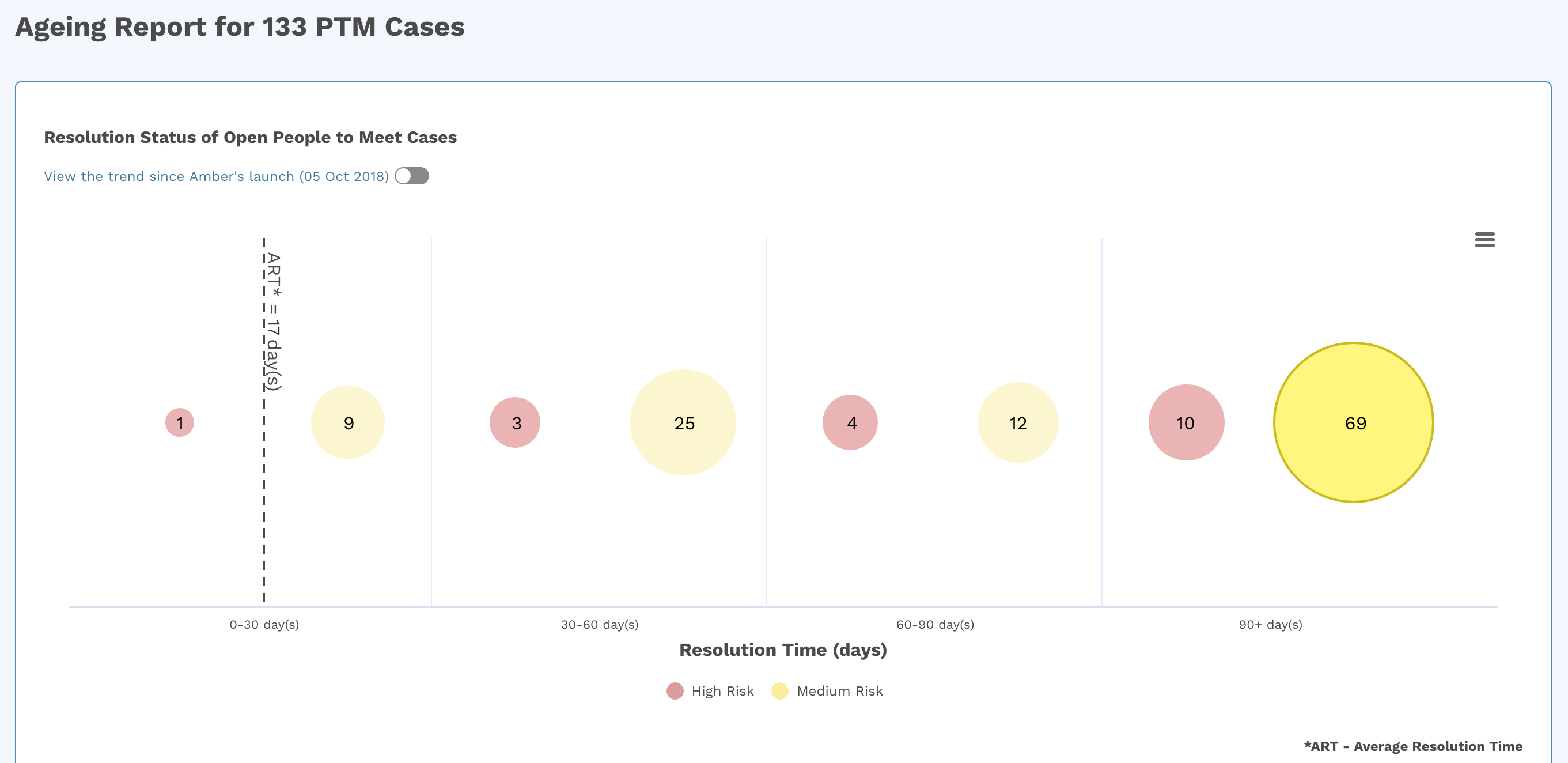
With our new ageing report available on Amber’s dashboard 2.0, you will now get the exact picture of how long there have been unresolved/pending People to Meet cases. This information will help you identify factors for resolution delays and proactively reach out and prevent disengagement across the workforce.
Prioritize the areas that you need to act on:
On the dashboard 2.0, the days are bucketed under four timelines:
- 0 – 30 days
- 30 – 60 days
- 60 – 90 days
- 90+ days
The severity intensifies as the number of days increases. Click on any one of the bubbles to deep dive further.
improved
new
Miscellaneous
Slice and Dice
Your Watchlist is ready for scale!
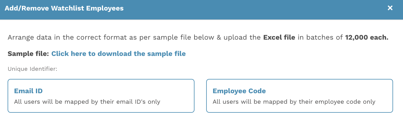
Amber’s Watchlist on dashboard 2.0 now equips you with a feature that enables bulk data upload related to high-performers:
- Download a sample format from Amber’s dashboard
- Just plug in/enter the relevant employee data you want to keep track of in the Watchlist
- Upload the file and voila! you can see the employees uploaded under the Watchlist filter and track them
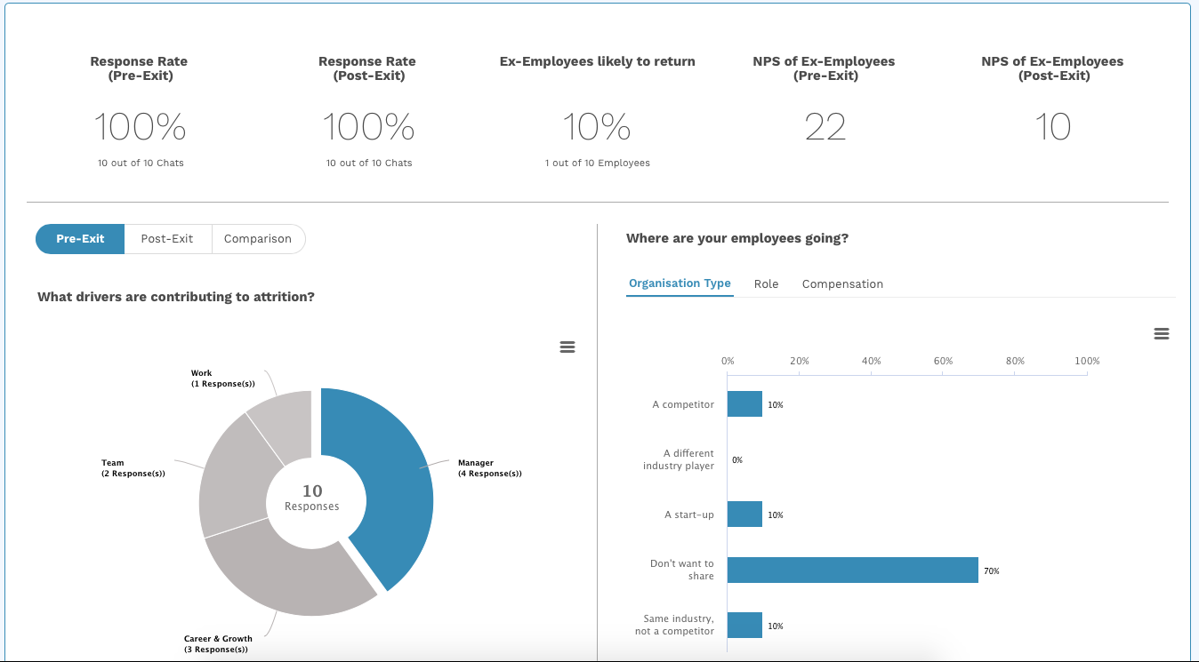
Now you can identify and understand the exact reason your employees are leaving you. Based on your employee’s interactions with Amber, her dashboard will enable you to slice and dice data on demographics while highlighting important engagement metrics as follows:
- Response rate:This provides a summation of the number of employees replying to Amber’s chat while they are on their notice period and have exited from the organization.
- Employees who might consider returning:This enables you to know how many employees (out of the total exits) have left the organization but would consider returning if given the right opportunity.
- NPS from ex-employees:This informs you about how your former employees perceive you through NPS after they have left the organization.
- Employee experience drivers:This provides a quick understanding of which driver is contributing to attrition and to what extent in your organisation.
- Where are your employees going?:This provides information related to where your former employees are going. For example, type of organisation type, role, compensation.
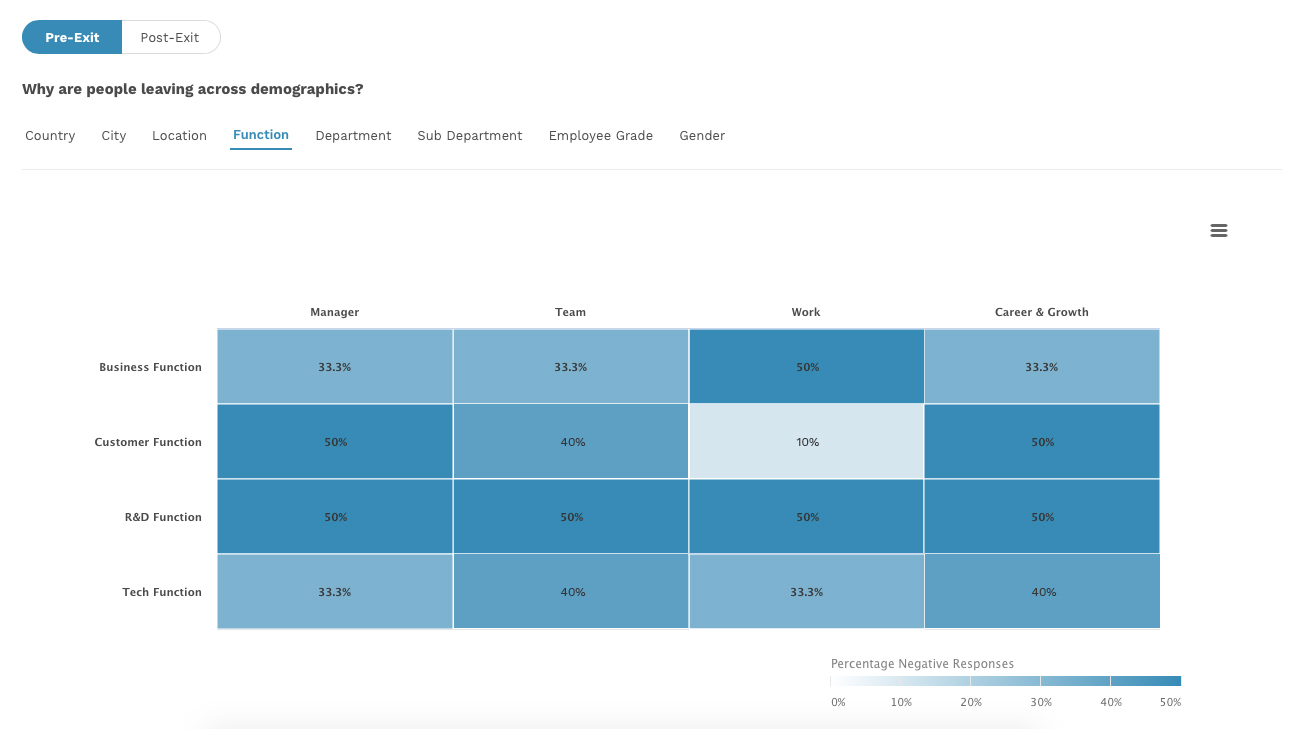
- Why are people leaving across demographics?:This will allow you to slice and dice data based on the drivers across demographics in your organisation.
Reach out on help@infeedo.com and subscribe to our Exit module to learn the exact reasons why your employees are leaving.
new
Miscellaneous
Sub Admins can now access Anonymous Bat!
Now no longer restricted to just Super Admins, we have now ensured that concerns employees share with Anonymous Bat can also be viewed by Sub Admins. This will help you prioritize and take quicker actions as and when required!
improved
Miscellaneous
Experience a new and improved Amber's Dashboard
Based on your critical insights on how we can further improve Amber’s capabilities, here are three critical features you’ll definitely see a difference in performance:
Faster CSV Export
: We noted from you that at times dataset exports from dashboard would crash when the volume was large. Now, this process is faster wherein we have ensured any export with 500,000 rows will be completed in less than 7 minutes. Reduced Wait Time for Overview
: Earlier, the Overview page took a minimum of 30 seconds to load, depending on employee count. However, now you can see this reduced to 8 seconds! Minimized Load Time Across Amber
: To ensure an overall faster experience, here’s the exact time taken for each page on the dashboard:- Chats Sent: 4-5 seconds
- Daily Summary: 4-5 Seconds
- People Page: 4-5 Seconds
- Recently Analysed Touchpoints: 4-6 Seconds
fixed
Miscellaneous
[On-Going] UX issues we’ve fixed so far...
Based on your feedback and after months of detective work, our Tech and Product teams have finally fixed 35 UX issues to ensure your experience on Amber’s dashboard is seamless. Here are the top 3 issues that you’ll no longer have to face while on the dashboard:
Issue 1
: Confusing filter names for Open, In Progress and Closed PTM CasesFIx
: Now the filter names read as PTM Case StatusImplemented on
: Old and beta dashboardsIssue 2
: After adding notes, you were not able to notify the sub-adminsFix
: You can now notify sub-admins as soon as you add the noteImplemented on
: Old and beta dashboardsIssue 3
: When you downloading, the required charts did not provide demographic informationFix
: You can now see all the filters applied while analyzing the PTM cases.Implemented on
: Beta dashboardNote
: These UX fixes will be an on-going, continuous process based on your feedback and our own findings. Keep sharing your views!We heard you! Now Amber won’t just be reaching out to your employees but also to your own team to track and measure the experience within HR as well. You can now enable the chat option for Amber to start reaching out to you! :)
new
Analytics
Dashboard 2.0
Know exactly why your employees land up in People To Meet
Introducing People To Meet Analytics!
To help you easily identify hotspots of issues along with reasons, we have made 2 updates to our People To Meet section:
- Deep Dive:Slice and dice basis all cuts available in your dashboard to understand where the problem exists. Click on a preferred bar in the graph to narrow down further and reach the next demographic.
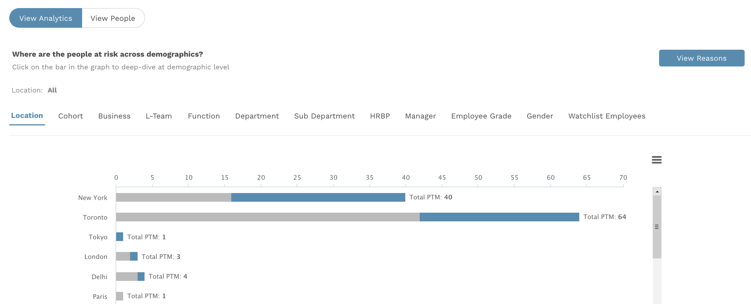
- View Reasons:At the demographic of your choice, click on view reasons to view a heat-map which correlates people to meet and employees experience drivers. This will help you identify and prioritise your actions.
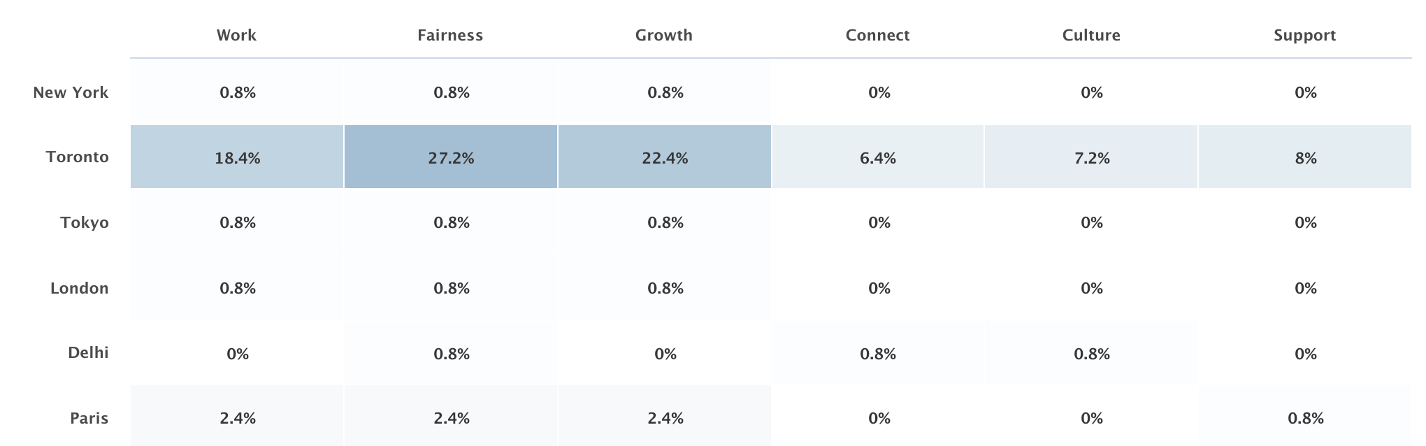
Need a more detailed understanding of PTM? Read all about it here.
new
Chat
Miscellaneous
Edit Amber’s Trust Statement to best suits your org culture
We understand that every organization has its own unique culture that allows employees to trust and love the workplace they are at. Similarly, we have ensured the Trust Statement Amber shares at the beginning of her conversation can be edited the way you feel best captures your organization’s ethos and encourages open, honest feedback.
We wanted to let you know that it’s no longer just a list of at-risk employees highlighted by Amber that you see under People To Meet (PTM)!
With our new upgrade, you can now view:
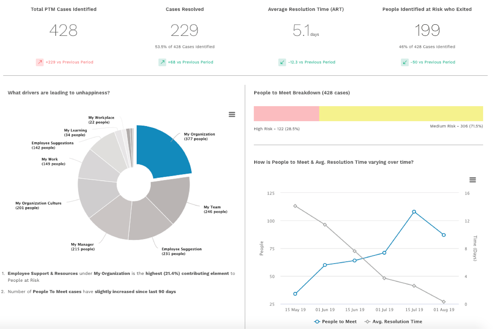
Average TAT
: To understand exactly how much time is taken on an average close a case under People to MeetEmployee Experience Drivers
: To see which employee experience drivers are affecting your employees (under PTM) the most Relationship between TAT and PTM
: To understand the trend that indicates how an increase or decrease in the number of PTM cases impacts your closure turnaround timePTM Breakdown
: To view a graphical representation that highlights what percentage of the PTM population is high and medium riskStay tuned to understand how you'll be able to slice + dice data and quickly understand the exact reasons for disengagement with just 3 clicks!
In the meantime, here’s all you need to know about PTM.
Load More
→